The moment I almost walked away
I was ready to close my laptop and call it a day. Spent so many hours tweaking, adjusting and second-guessing my approach - it really felt like nothing was working.
That really lush LED effect I had in my head just wouldn't translate to the screen. Almost every attempt just looked off. The shapes were strange, the offsets didn't line up, the bloom was just a little too bright. I just couldn't get it to look right.
Something kept me going, though. Maybe it was stubbornness, maybe just curiosity. I'm really glad I didn't quit.
Why did I want to make this?
There's just something about that look that really just hits different. I've always been fascinated with that whole retro-futuristic aesthetic, and I wanted to try and capture that using a shader.
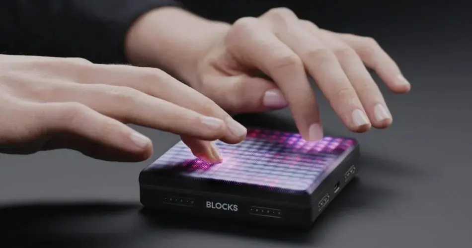
Years ago, I bought a piece of music hardware called the Roli Lightpad Block. It's a small device with a grid of LEDs that you can use as a midi controller, or program a sequence of patterns to play with. The look is just so cool, and using it is really fun.
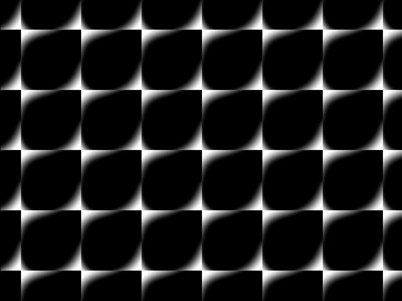
There's just this incredible depth to it. Colours jump off the screen in a way flat colours never can. I love the way light pools in those circular cells, and how the grid creates such a nice rhythm and pattern - it's a timeless look.
That sort of retro-futuristic aesthetic is just such a paradox - it feels both nostalgic and modern at the same time.
The long road to success
My first attempts were pretty awful. I started with what I thought would be simple - just create a grid pattern and throw some shapes in it. I was wrong.
The problems started small and just kept stacking:
- Shapes
didn't align properly- the offsets weren't working - The grid felt
stiff and lifeless- this was a recurring theme - The
repetitionsin the grid were way too obvious - The actual LED effect just looked
too clean- the glow was just a little too bright
I tried all sorts of different shapes, different spacing, scaling coordinate spaces. Nothing felt right. Each version just had something wrong about it.
The breakthrough
The turning point was when I just started to trust the process, so I started over and simplified my approach.
Here's what finally worked:
import { Fn, fract, pow, float, smoothstep, length, screenSize } from 'three/tsl'
import { screenAspectUV } from '@/tsl/utils/function'

const ledPattern = Fn((props) => {
  const {
    resolution = screenSize,
    cellSize = float(10),
    intensity = float(0.5),
    intensityFalloff = float(1.8),
    edgeSoftness = float(0.2),
  } = props || {}

  const _uv = screenAspectUV(resolution).toVar()

  // Scale the UV space to create our grid
  const _scaledRes = resolution.div(cellSize)
  _uv.assign(fract(_uv.mul(_scaledRes)).sub(0.5))

  // Circle pattern
  const pattern = length(_uv.div(intensity)).oneMinus().toVar()

  // Add smoothness and punch to the edges
  pattern.assign(smoothstep(edgeSoftness, 1, pattern))
  pattern.assign(pow(pattern, intensityFalloff))

  return pattern
})
The keys to the whole thing were:
- Properly
setting up the coordinate space - Using really
simple shapesfor the LED effect - Dialling in the
falloffandsoftnessof the LED effect
This approach was really simple, but it paid off big time.
Breaking it down
The fract() function repeats the UV space. This creates our grid of cells. Then length() calculates the distance from the center of each cell.
// Scale the UV space to create our grid
const _scaledRes = resolution.div(cellSize)
_uv.assign(fract(_uv.mul(_scaledRes)).sub(0.5))
The magic happens with smoothstep() and pow(). Smoothstep softens the edges so they're not harsh. The pow function adds punch and contrast, making the LEDs pop.
I also explored other shapes during the process:
// Diamond pattern
const pattern = abs(_uv.x.div(intensity))
  .add(abs(_uv.y.div(intensity)))
  .oneMinus()

// Square pattern
const pattern = max(abs(_uv.x.div(intensity)), abs(_uv.y.div(intensity))).oneMinus()
Circles won because they felt organic and a bit more authentic. They have that natural light falloff that LEDs actually have. The other shapes look really cool in certain contexts though.
Another compound technique
This effect is actually a compound of several techniques:
- Grid systems through Domain Repetition
- Geometric Shapes for our shapes (Specifically SDF Shapes)
- A bit of Procedural Color Palettes to learn about falloffs
None of these techniques are complex on their own. But combining them creates something that really feels polished.
Sometimes you need to step away
Here's the thing that really helped me crack the problem: I took a step away from it.
After hours of frustration, I closed my laptop, took my dog for a walk, touched grass - literally anything else.
Something I think is often overlooked is the importance of downtime - letting your body and mind rest and digest. How many times have you been completely stuck on something, only to have the solution pop into your head when you're doing something completely different like going for a walk or taking a shower?
That's your brain subconsciously processing what you've been working on. It's an extremely powerful trait you can actually take advantage of.
I like to think of my brain like a muscle - you put it under some stress, then give it time to recover and it gets stronger. Not exactly like that, but you get the picture.
When I came back the next day, the solution just clicked.
Some things that help me when I'm stuck:
Go for a walk- movement helps clear your headSleep on it- your brain processes things while you sleepDo something completely different- switch contexts entirelyTalk it through- explaining the problem to someone often reveals the solution
Remember, progress is not linear. The breakthrough isn't always about working harder. Sometimes it's about giving your brain the space and time to solve things on its own.
The payoff
Seeing it finally work was incredible. That moment when the shapes lined up, the grid felt alive, and everything just clicked into place.
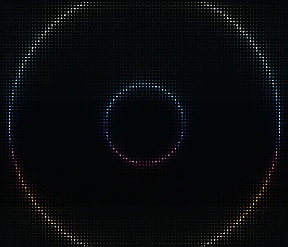
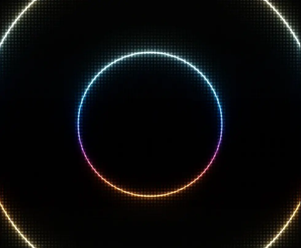
The LED effect makes visuals pop in ways I didn't expect. It adds texture and depth without overwhelming the original image. You can use it subtly or crank it up for a retro aesthetic.
Was it worth the hours of frustration? Absolutely.
Try it yourself
Want to experiment with the LED effect in your own work? Check out the full implementation in Fragments. You can tweak the cell size, intensity, and edge softness to get exactly the look you want.
The code is all there, ready to drop into your shaders.
If you'd like to unlock Fragments and get access to the full collection of techniques, utilities, and over 120 shaders with full breakdowns, you can sign up here.